• RATIONS

    Book + Motion Graphic

Description

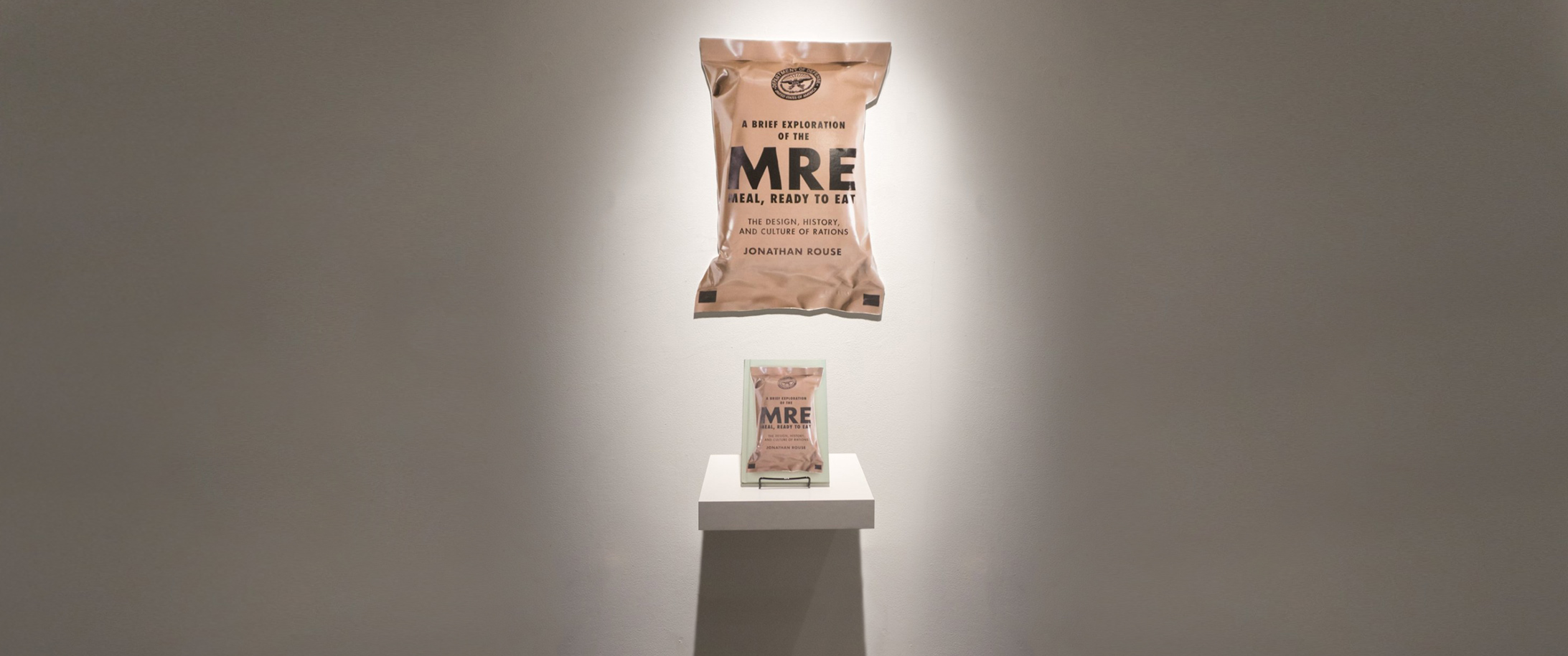
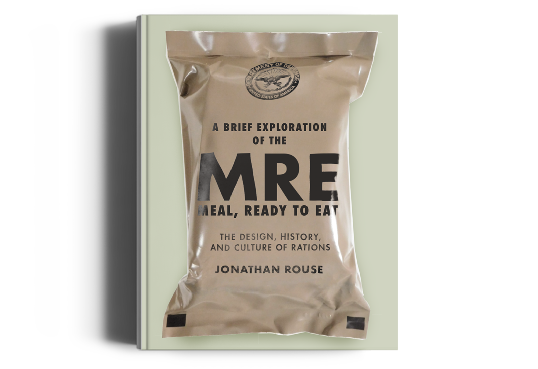
For my senior thesis final at George Mason University, our class was required to write a full book about a topic we found to be unique or interesting, to be shown at the senior showcase. This book was required to be written entirely by the student, using correct grammar and citations, as well as a majority of the photography must be taken by the student, and correct typography such as ligatures, and kerned type must also be used. For my topic I chose to do a book on military rations.

Date

September–December 2017

Skills

Style Guides
Packaging
Illustration
Motion Graphics
Storyboarding

Motion Graphic

Adding Challenge

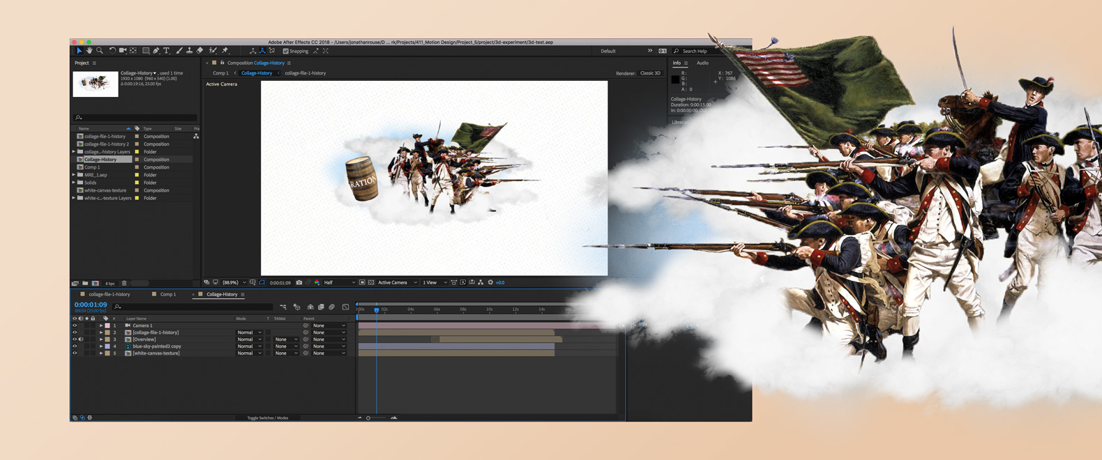
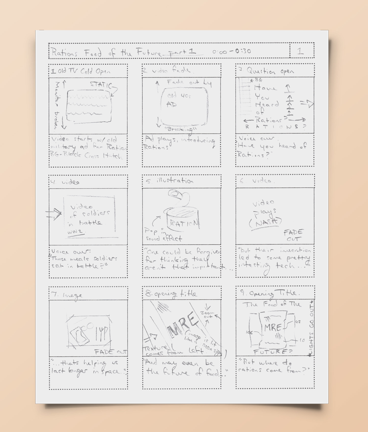
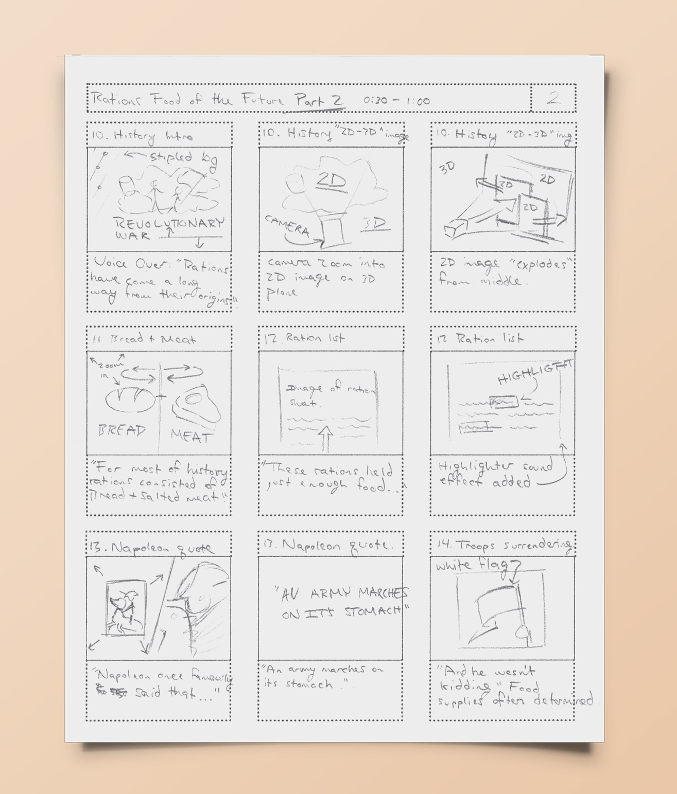
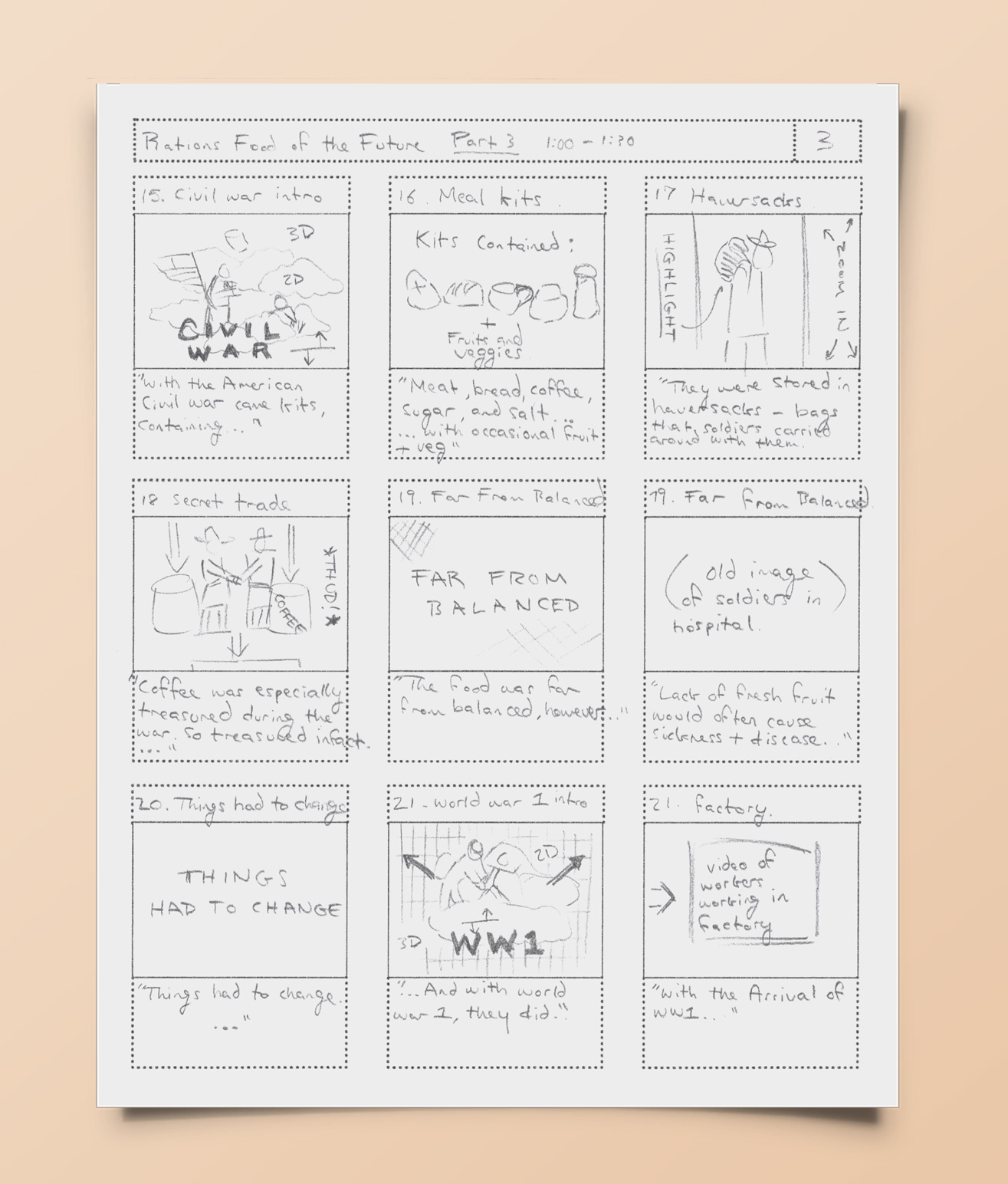
Along with the required book, I also created an advanced motion graphic “explainer” video (shown below) to compliment the project at the senior showcase. This project included illustration, typography, style guides, motion graphics, writing skills, storyboarding, packaging, and a lot more. It also required a lot of coffee to make.

Why Rations?

Rations are Amazing

Current day rations, called MRE’s (Meal, Ready to Eat) are rations that can that can be eaten whenever, wherever, on any terrain, and last years without needing refrigeration. It’s a creative problem solving masterpiece, with the simple food items meshing perfectly with beautifully simple packaging, and a complex distribution method that manages to feed a soldier an entire healthy meal with so little waste. These marvels of design get practically zero attention from the design community so I wanted to shed light on the subject.

Choosing the Style

Collages on Collages

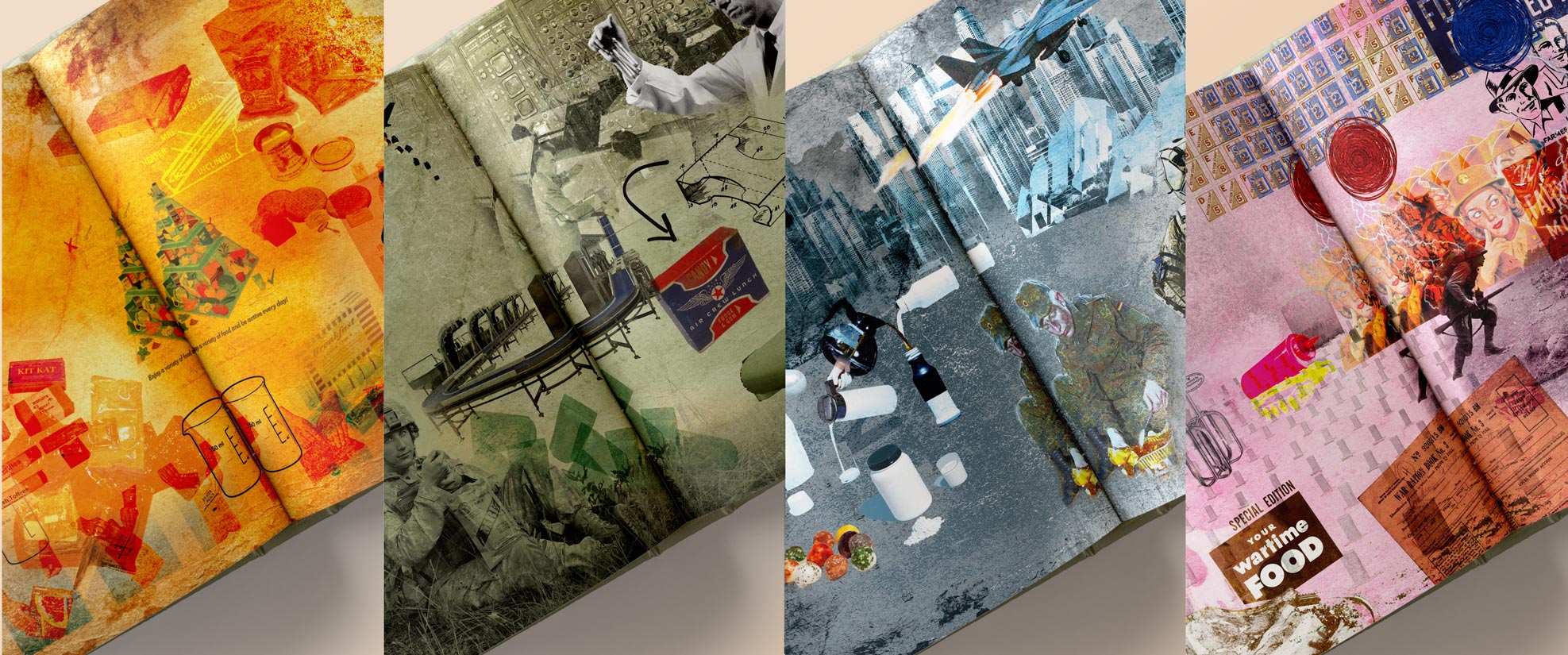
Selecting the style for the book was both challenging and rewarding. I wanted the book to feel unique, without the cliché of usual military style. Because the ration style of the 1940s felt the most utilitarian without resorting to the camouflage and gun metal, I opted for a 1940s propaganda look, creating collages for the chapter openers reminiscent of dadaist art movement collages of the same time period.

Typography and Layout

Futura: The Font of the 40s

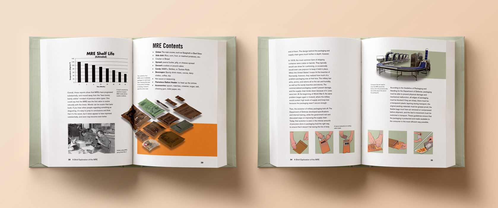
The typography in the book mimics the typography of the 1940s, with typefaces like Futura for title sections, Akzidenz-Grotesk for body copy, and Trade Gothic for subheads, to convey that old style while still feeling fresh. The layout is made of three and four column grids, depending on the requirement of the section.

Food Photography

Photographing All the Dishes

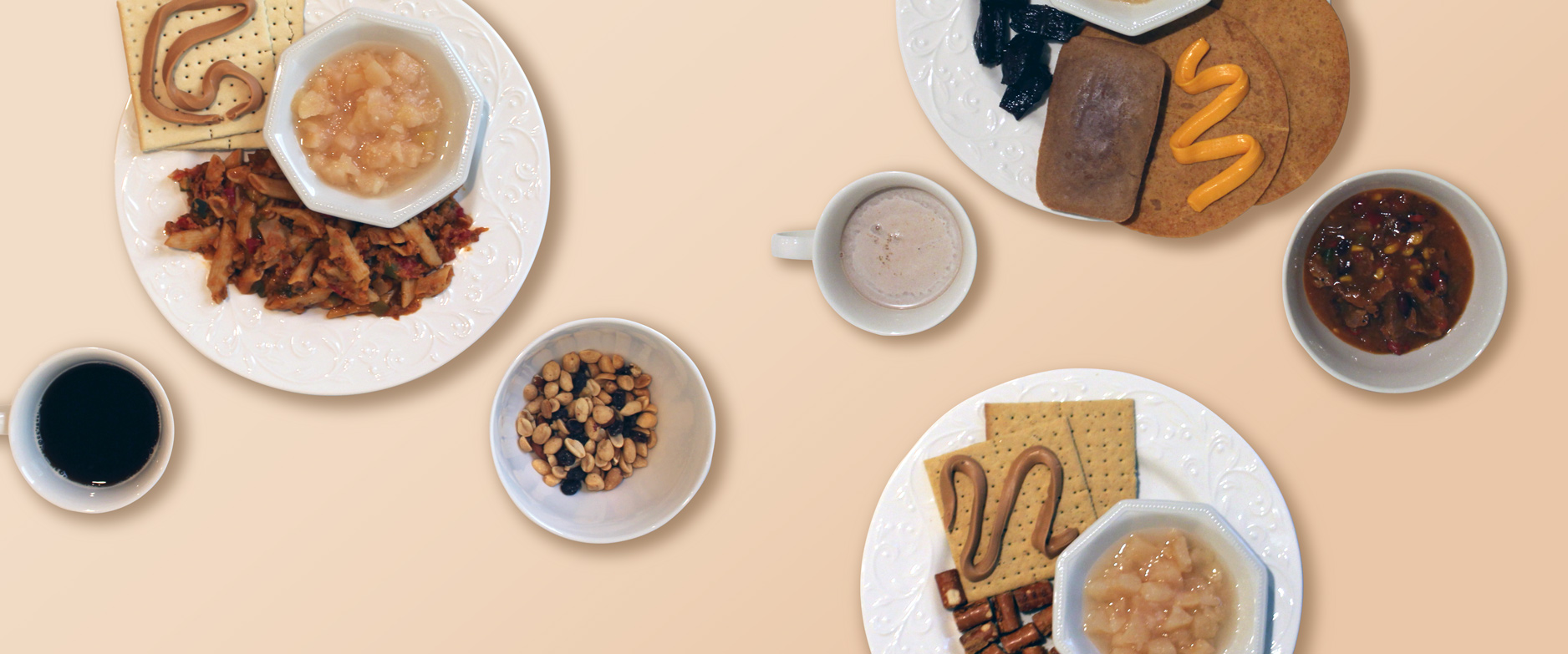
All of the food photography in the book was taken by myself. I took photos of 12 real combat rations, plating them so that the viewer could have a better idea of what our soldiers eat, as well as creating the experience around eating rations.

Motion Graphic

Putting Things in Motion

Building the motion graphic took several days of work to produce the video to the level of quality that I wanted. As well, I wanted to separate the style of the motion graphic from the book somewhat, to better differentiate the audience for each work. Some viewers will likely just watch the video, as it’s quick and easy to understand, giving the most basic information — but people who are more interested in the topic may read the book and learn more in-depth about it.

Storyboarding

Creating the Story

From sound effects, music, stock video, voice-overs and more, I had to command a variety of different mediums, and mesh them together to create a cohesive story – to get across information. It’s a lot of work, especially with script writing, recording my own voice, building the style guidelines and more. I had use many advanced techniques in Adobe After Effects in order to achieve the look and feel that I wanted.

Senior Showcase

The Final Presentation

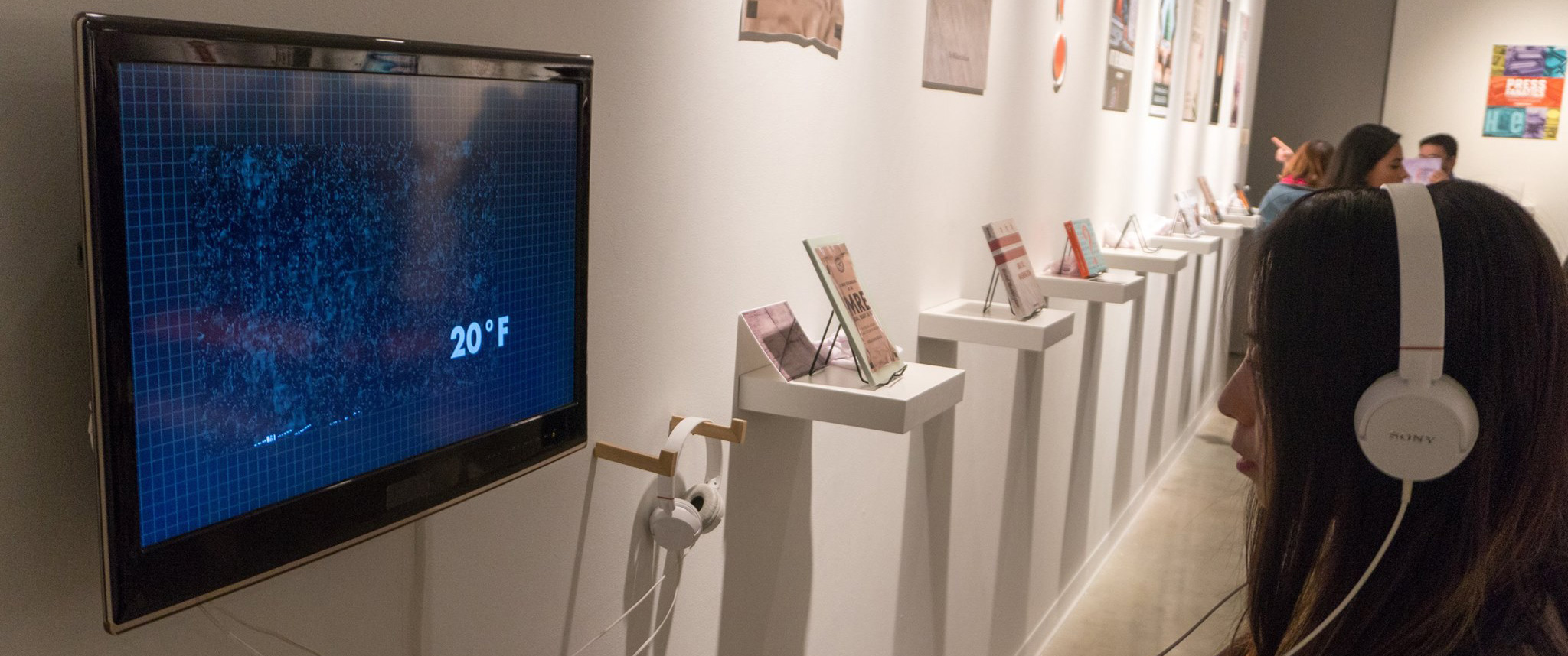
The video was released to the senior showcase alongside my book, and both were a rousing success. Many people, including veterans came up to me looking to learn more about the medium, and thus bringing awareness to the topic. Problem solved.

Conclusion

Wrapping Things Up

Lastly, my job as senior liaison for the senior show required me to move into leadership positions that I had never gone into before. I had to fulfill a lot of time sensitive tasks while managing other people’s expectations and trying to make both the class happy, and getting things done in a timely manner. This included paying for prints, designing the door display, managing and coding the senior show website. This project was difficult, but I’m only just getting started. I have a lot more to learn, and I’m excited for where I go to next.

Let’s work together.

©2026 Jonathan Rouse | All Rights Reserved.