• Atlas Dashboard

    UX / UI

Project Overview

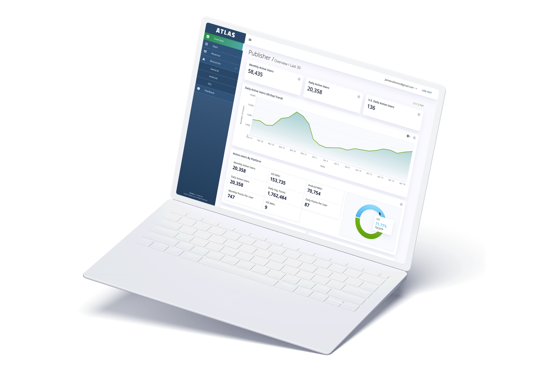
X-Mode Social is a location data startup that provides anonymized geolocation solutions for the advertising, cybersecurity, and financial industries. In my role as Product Designer at X-Mode, I was tasked with branding and designing a dashboard which allows data suppliers to view pay statements, file invoices, as well as understand the quality of their data. I was a product owner from beginning to end of this project, and helped to create a unique asset for the company, in the form of a dashboard named Atlas.

Responsibilities

Branding
User Research
User Journey
Wireframes
Interaction Design
User Testing
Process

Discovery

Competitive Analysis
User Interviews
Stakeholder Interviews
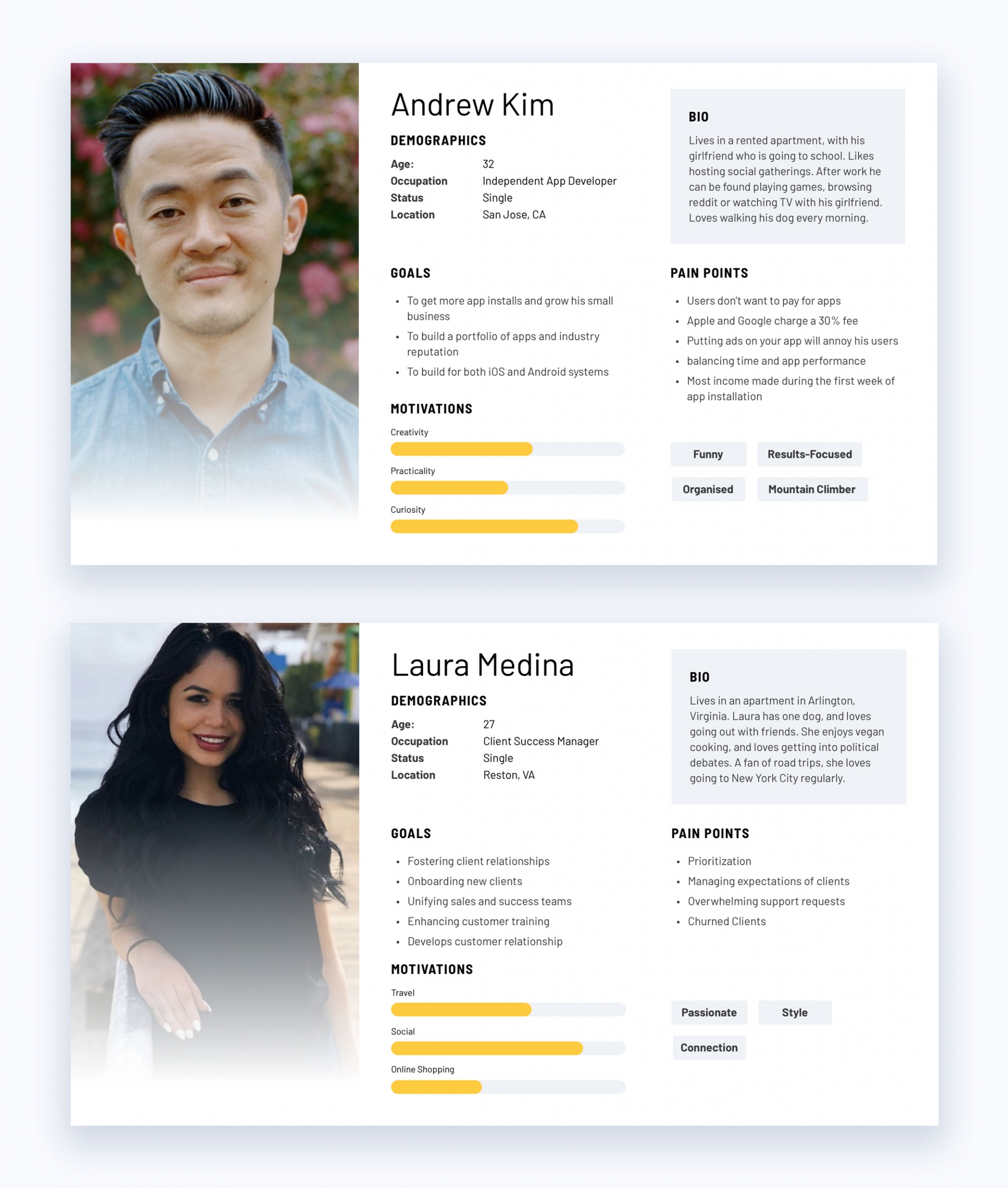
User Personas

Define

Information Architecture
Sitemap
Wireframes

Design

Visual Research
Style Guide
User Interface
User Testing

Develop

Project Handoff

The Problem

Why X-Mode Needed Atlas

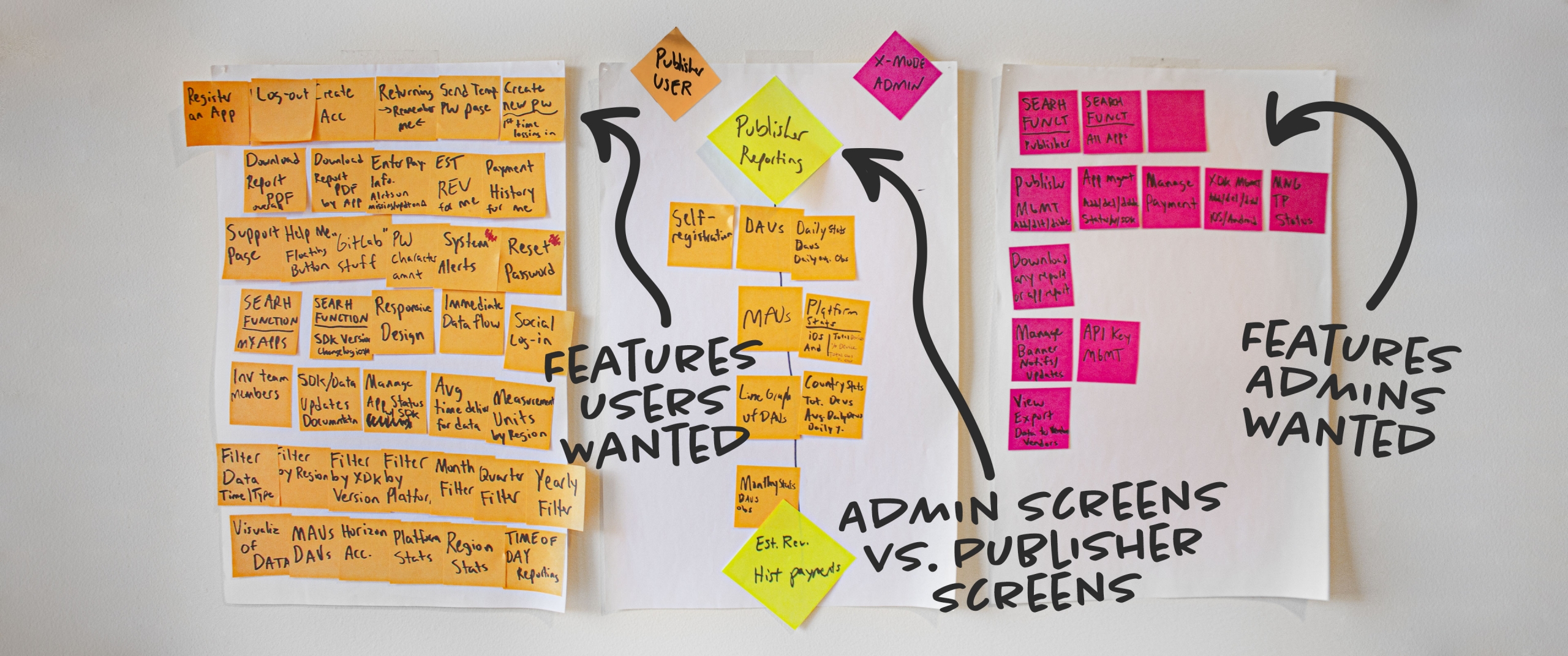
I began by interviewing stakeholders and did a competitive analysis. I sent out surveys to current data suppliers to understand what they wanted from a dashboard. These were some insights from that research:

  • The dashboard was highly requested. App publishers wanted to be able to manually view how much they were making monthly
  • It helps app publishers file their invoices on time without bothering our client success managers
  • It expedites the onboarding process for new app publishers onto X-Mode’s network

Branding

Giving a Face to Our New Dashboard

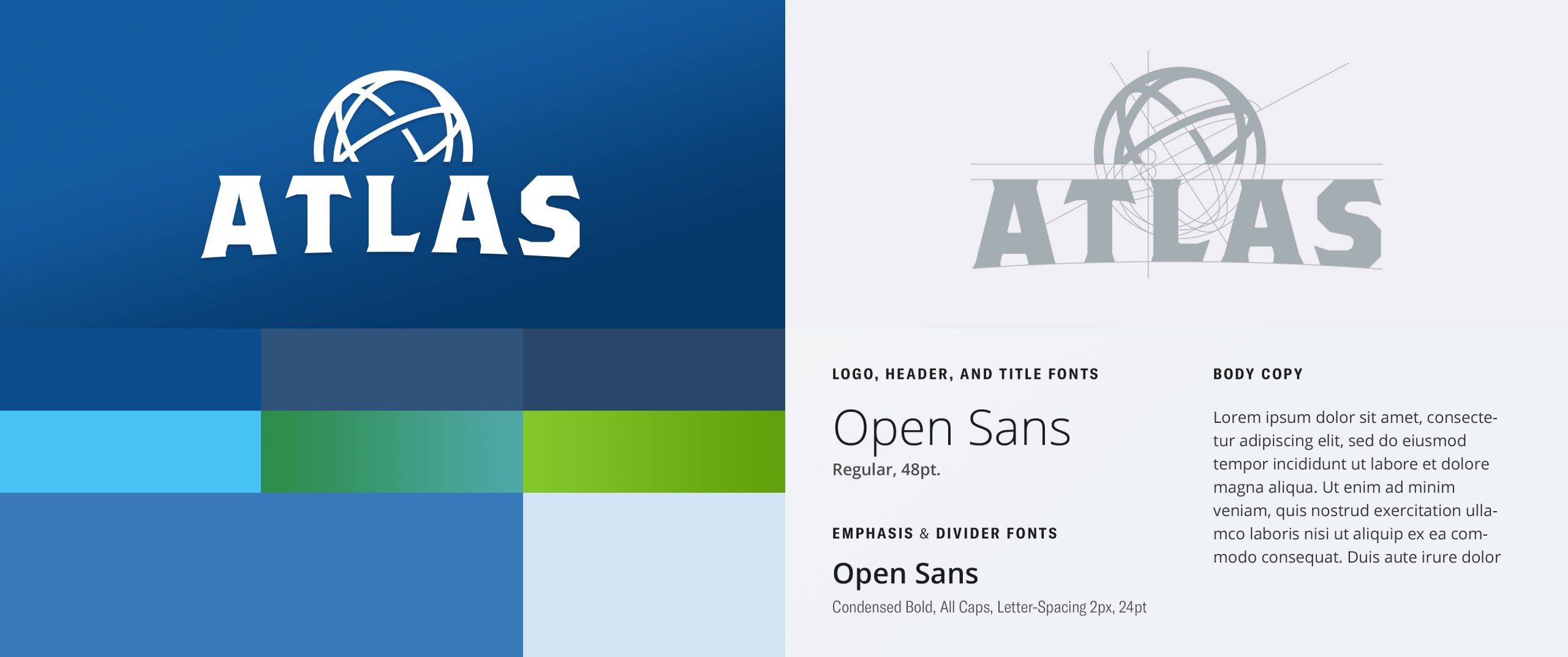
I was also tasked with creating the branding of the dashboard. The final name was chosen: Atlas, for the dashboards ability to help understand where people go in the world. After a lot of research, I designed a logo referencing Atlas, the titan from greek mythology.

Wireframes

Building Structure

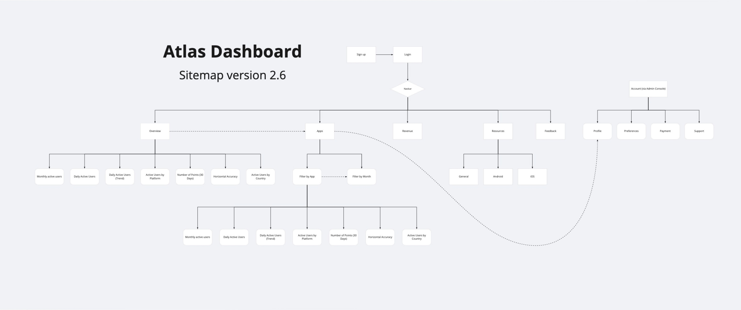
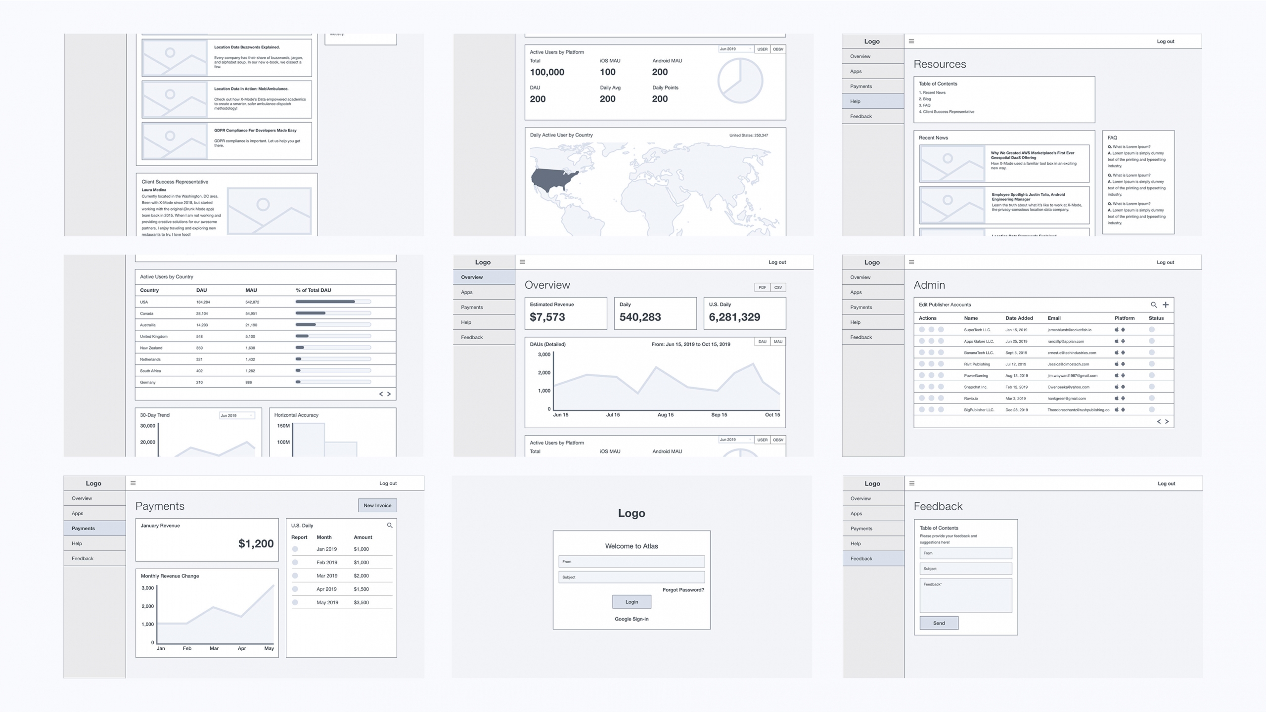
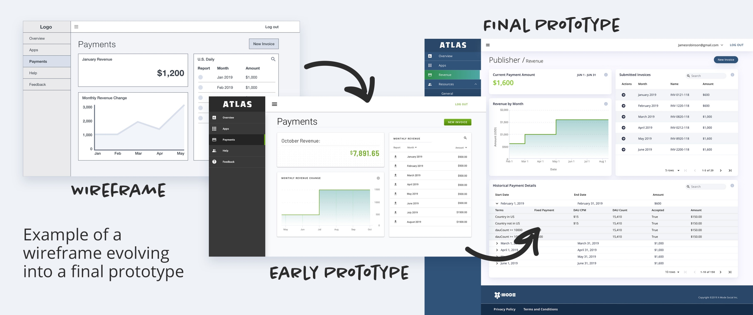
After collecting all the data, I worked with a project manager to define the way information would be structured on the dashboard. I constructed a site map and wireframes.

User Interface

Giving Life to Our Wireframes

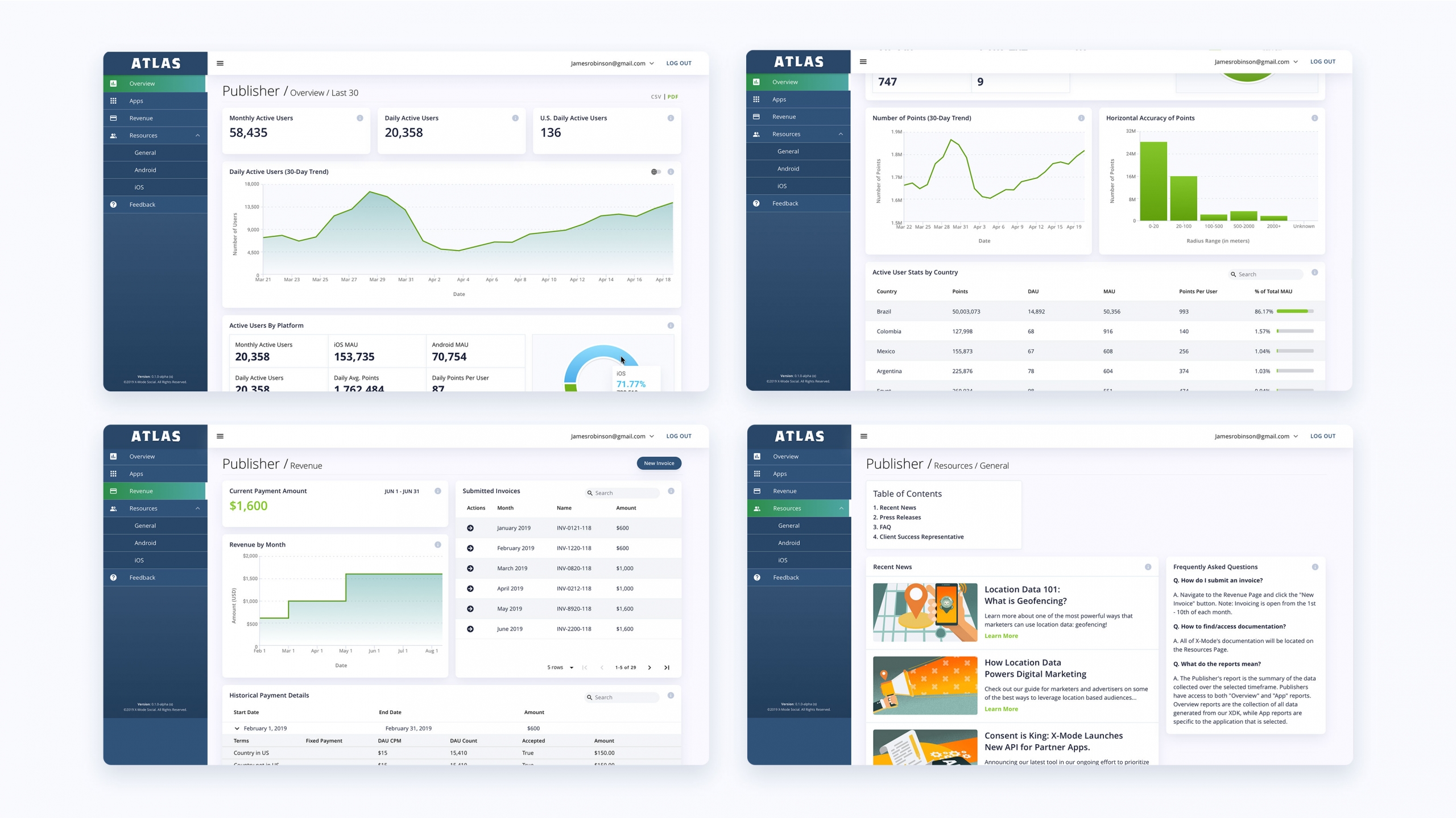
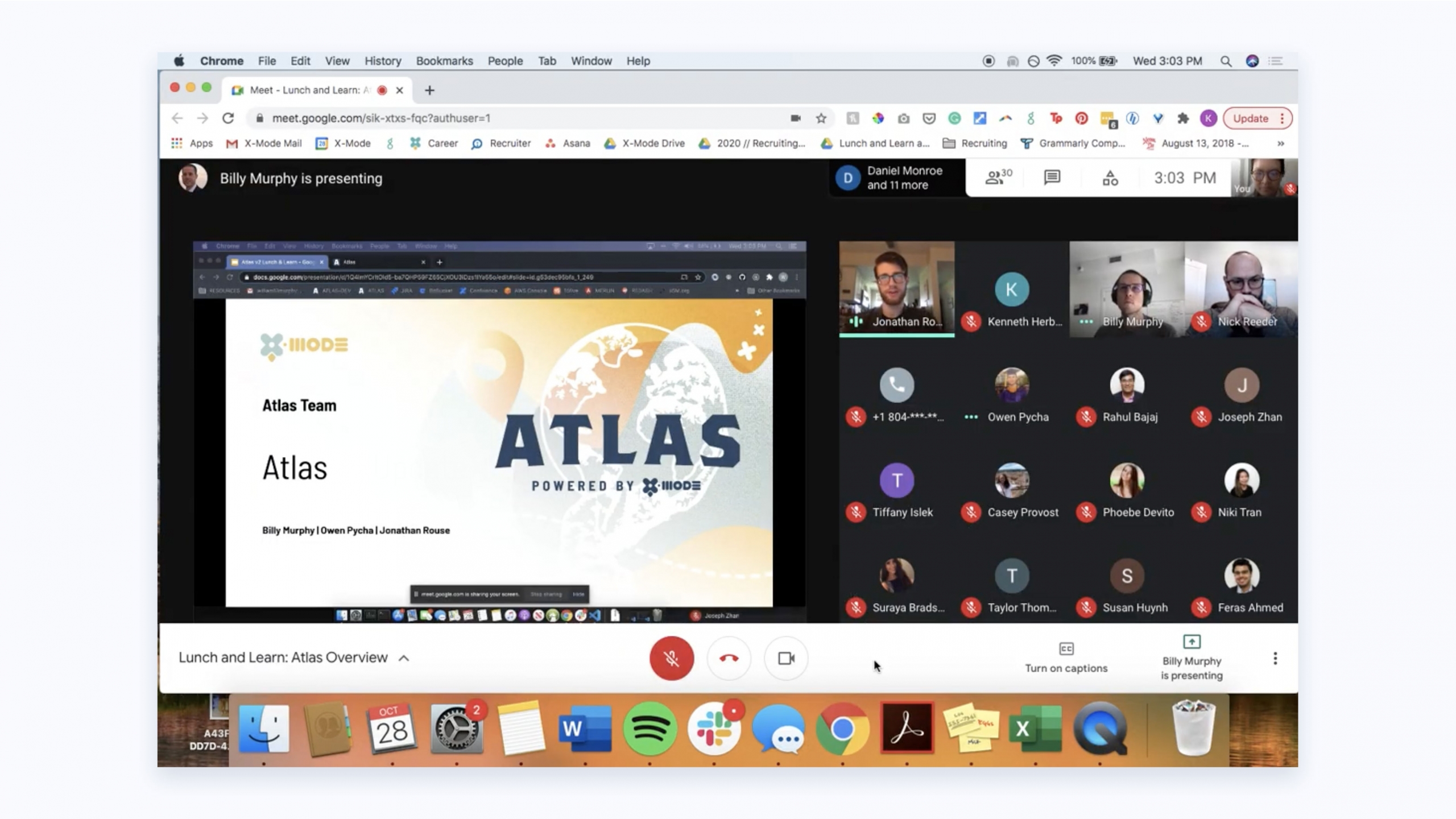
After several revisions, I came to a visual style that worked and standardized any components needed to be delivered to the software engineer. After that, the hand off to development commenced, and an alpha version was created. Select data suppliers would test early versions of the dashboard, and after several revision cycles, the final product was delivered, on time.

Results

Faster, Happier Employees

Since its launch, Atlas has been a key selling point to attract new data suppliers looking to monetize. The company has seen an increase in contracts signed for new data suppliers, and it now takes less time for client services to onboard new data suppliers. This was a project that really tested my ability to work on a team with multiple product owners where everyone did their part. Creating a dashboard like Atlas isn’t easy, but it is highly rewarding, both for me as a designer and the company.

Let’s work together.

©2026 Jonathan Rouse | All Rights Reserved.