• MOPAR

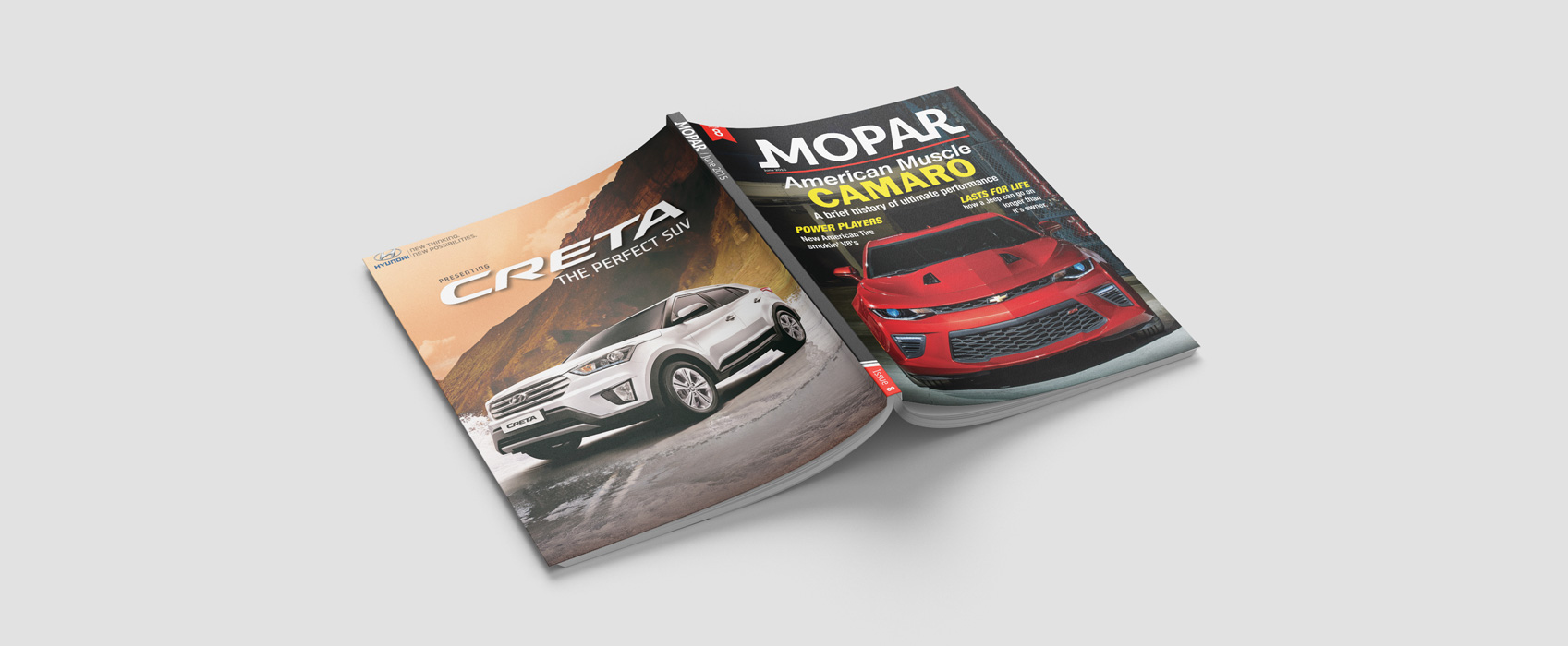
    Redesigned Magazine

Description

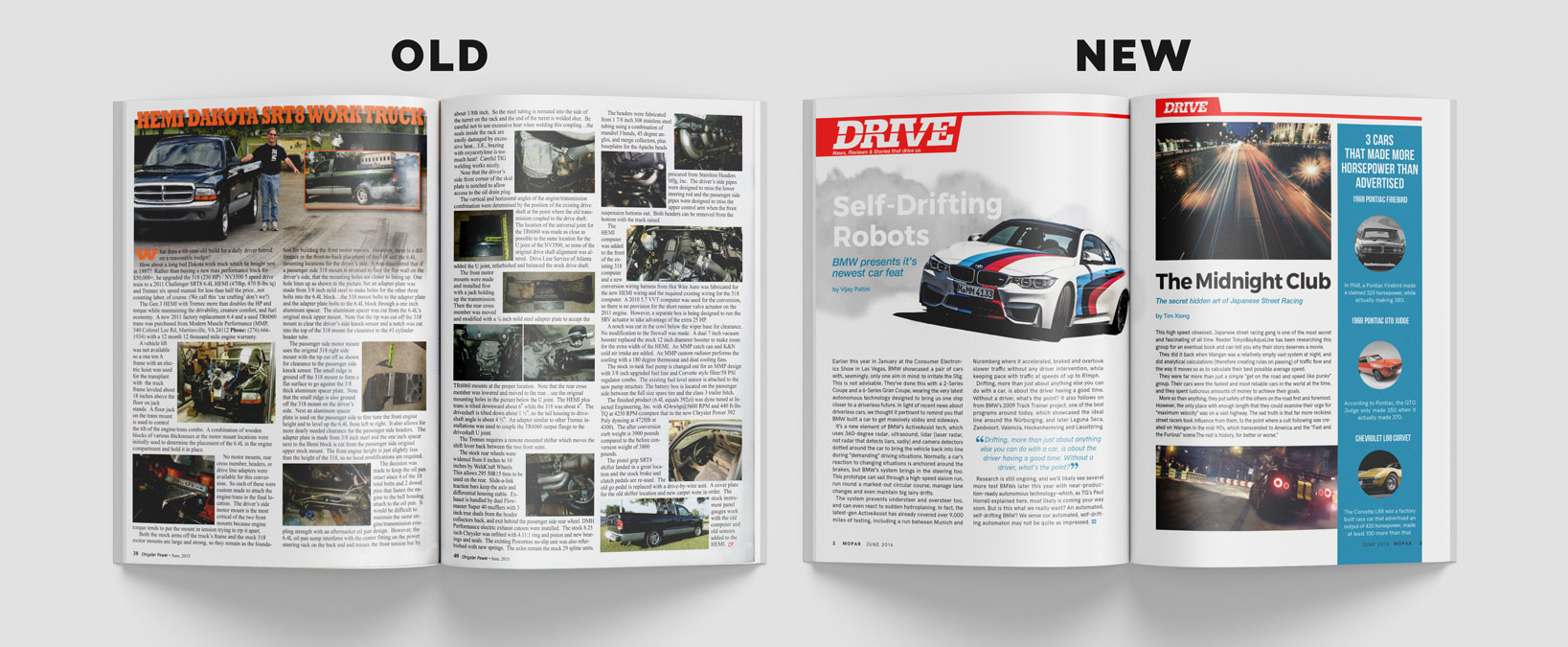
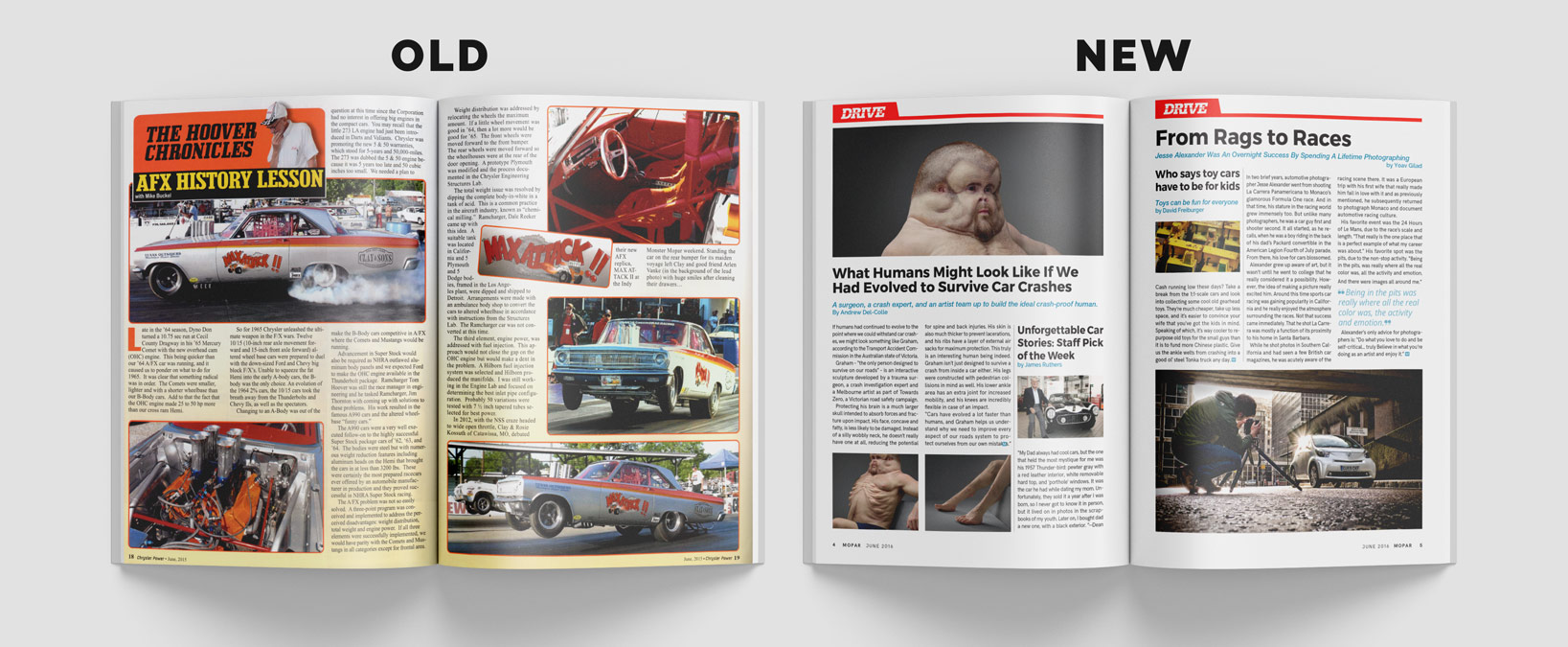
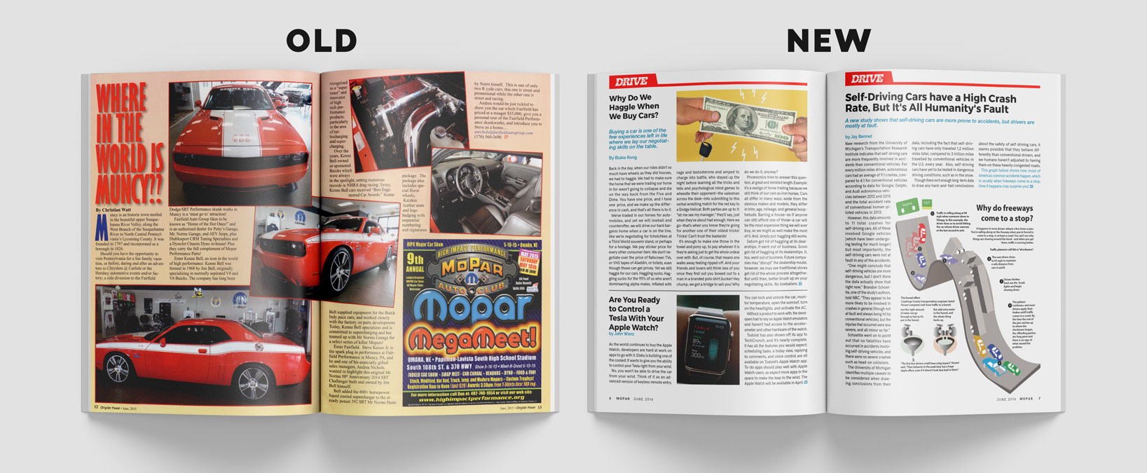
This project had me choose a magazine to redesign which I thought could use more clarity in the structure, layout, hierarchy, color palette or branding. The magazine I chose was Chrysler Power, an auto enthusiasts magazine that showcases cars and car culture.

Date

August 2016

Skills

Editorial Design
Branding
Typography
Layout
Grid
Rebranding

Giving A Brand New Life

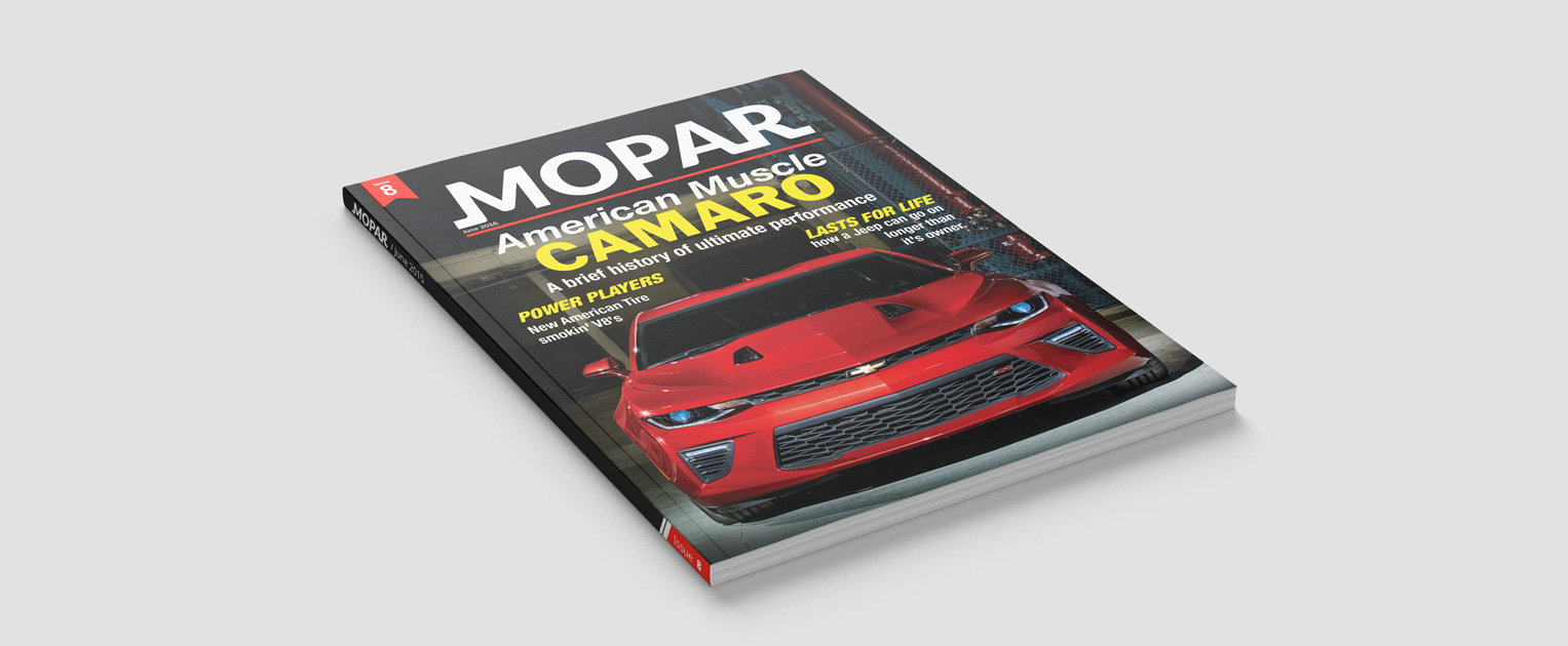
I wanted to rebrand the magazine, as its previous brand strategy was inconsistent. I did this by incorporating a clean, white logo with three brand colors: red, yellow, and blue. I wanted to open up the brand to show a wider spectrum of content.

Layout

Improving the Layout

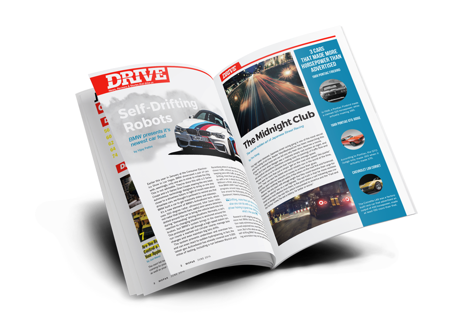
I redesigned the layout of the magazine to be clear, fluid, and fast like the cars it showcased. Most of the articles in the previous design didn’t differentiate themselves, instead blending together, often overlapping one another. My design places emphasis on the variety of cars and articles shown, while remaining loyal to the brand structure.

Photo Quality

Improving Photo Quality

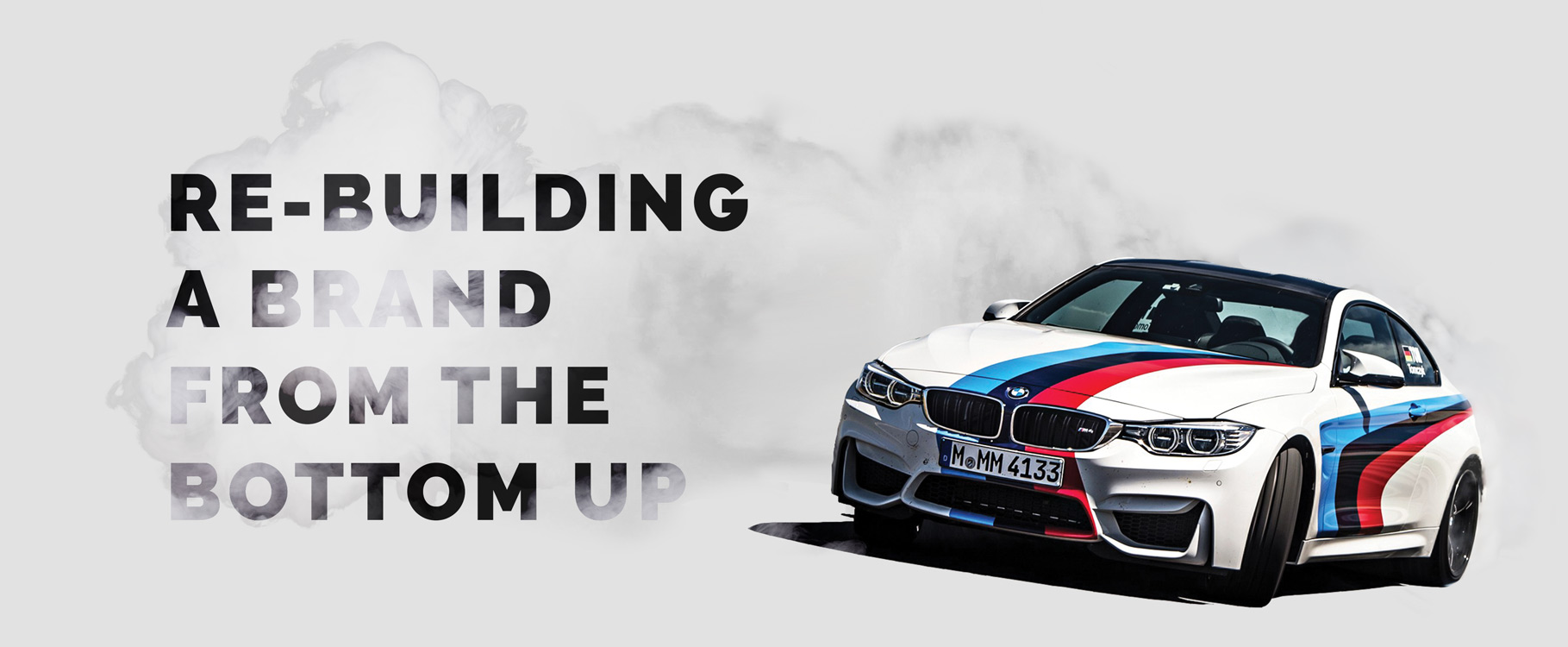
The quality of photos in the book was another consideration with the magazine. The magazine had photos that were blurry, and often didn’t relate to the content at hand, so I made sure to use high quality photographs that discusses both the topic and also grabs the viewers’ attention.

Let’s work together.

©2026 Jonathan Rouse | All Rights Reserved.